The center of the home. Where you spend so much time, whether you intend to or not. I’ve found that it doesn’t matter how nice the rest of your house is, people always end up hanging around the kitchen. So let’s dig into the one at Woodvale Manor
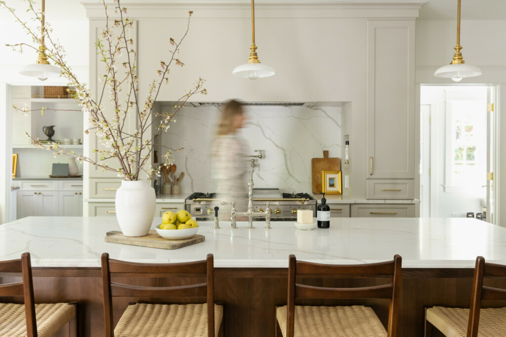
I wanted to get away from white kitchen cabinets in this house and think that the result was so worth it. It can be scary to do something different with something like cabinets that can’t just be easily painted over. But this soft grey is so beautiful and I think the perfect solution. And the brass hardware on the range compliments it so beautifully
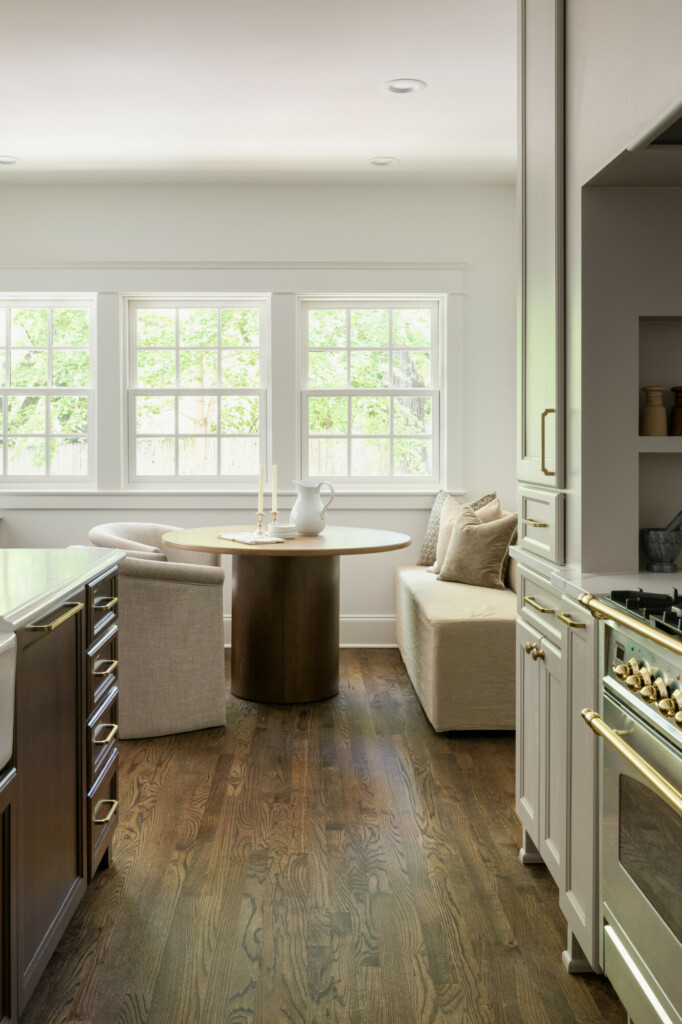
The overall layout of the kitchen was something that I never wavered from. When I was putting the floor plans together my architect kept trying to push me in a more square direction but once we came up with the footprint I knew what I wanted the kitchen floor plan to look like. With immediate access to a side door outside, maybe to take the trash out, as well as to the large butler’s pantry and buffet cabinetry and a breakfast nook this kitchen has loads of features that not only look lovely but also lend beautifully to functional everyday use.
While a typical upper cabinetry layout would have provided more storage, I knew I wanted the wall around the range to be a focal point. From the point of view of the kitchen, this was going to be a focal moment. So not only do you have the storage of the counter-to-ceiling upper cabinets but you also get the design element of the alcove layered by the island lighting. Plus you absolutely need this beautiful range to be a focal point, I mean, gorg.
Continuing with the cabinet design, my designer kept calling this space as ‘the pantry’ because it quite literally is big enough to serve as one. You know me and storage, you can’t have enough of it! And it mirrors the paneled fridge right next to it for a symmetrical look.
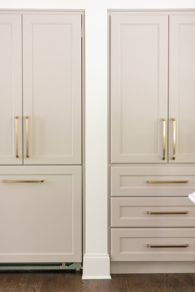
And let’s not forget the 10 foot island, huge farmhouse sink, bridge faucet and paneled dishwasher! Overall this kitchen was a joy to work on and came together even better than I could have imagined. I envy the mornings you could have in this area; making a coffee in your butler’s pantry, cooking pancakes on the beautiful 48” Italian range, then sitting in your breakfast nook enjoying your Saturday morning. That sounds pretty good to me
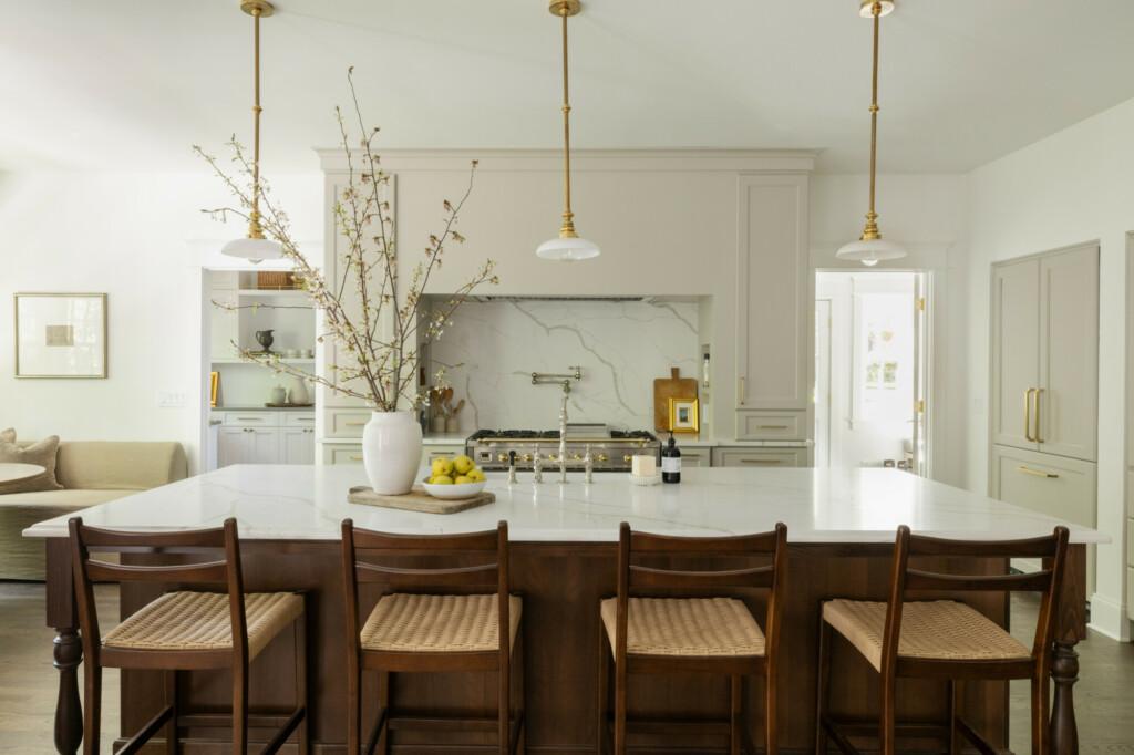
If I had to pick my favorite features?
1. The panel ready fridge
2. The statement backsplash and pot filler
3. The huge farmhouse sink and bridge faucet!
4. You still have loads of space to use and enjoy a huge kitchen island
5. The hardware. It’s got the sweetest little design detail to it that is such a great departure from the boring handles you see everywhere.
Overall I am so pleased with how this kitchen turned out. It’s got character, depth, and loads of function.



So BEAUTIFUL!! Do you mind sharing your wall cabinet color in this kitchen?