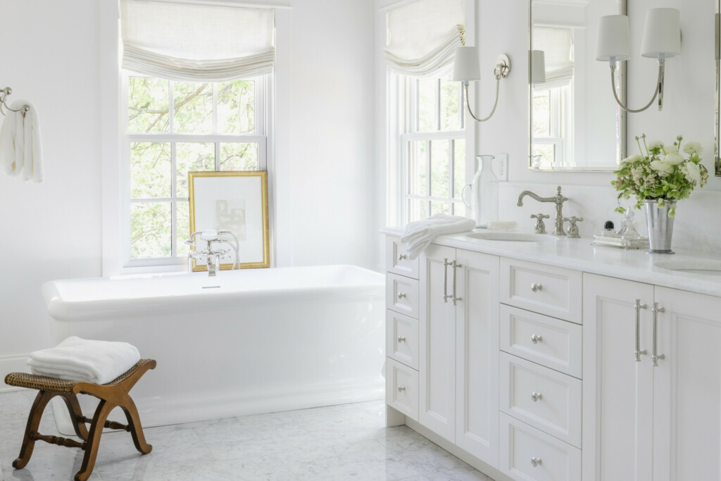
The bathrooms in my projects are where I spend so much time and thought on the design. Because I don’t get to style and decorate the homes to completion the way that I’d like, areas like the bathrooms and utility rooms are where I get to shine! And this primary bathroom in particular was everyone’s favorite.
My builder in particular kept raving about the tub! I have never heard him so excited about something, so I knew that was a good sign. And my husband said many times that it felt like a suite at the Ritz, but I’m pretty sure he just knows the way to my heart. I wanted this to feel classic and clean, but luxurious.
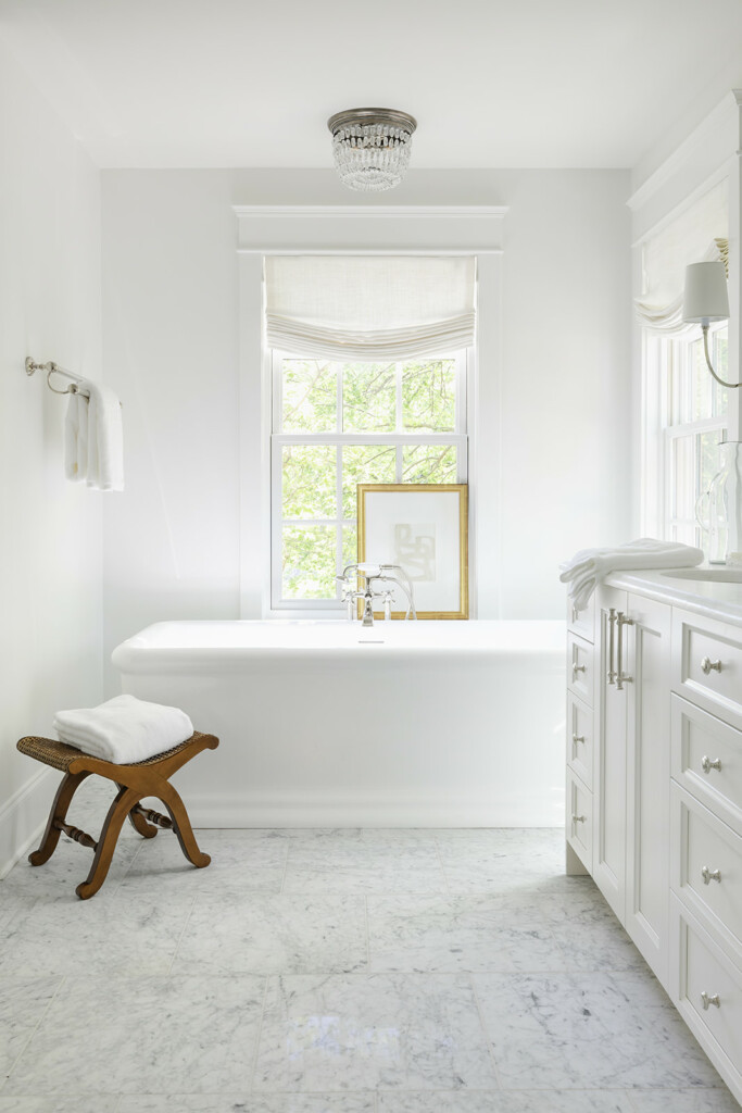
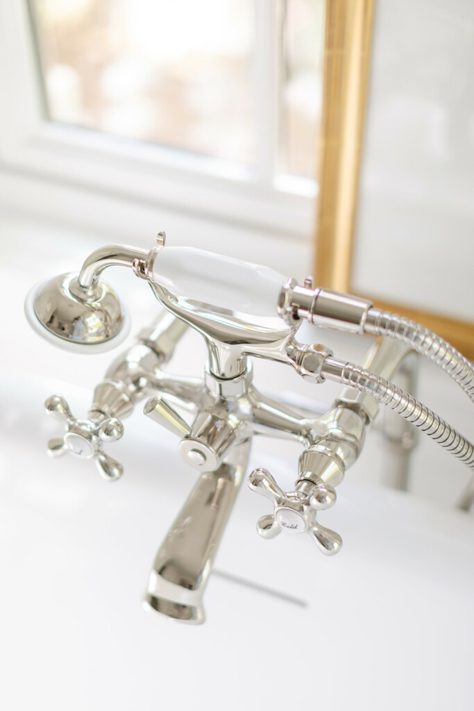
While I am the first person loving on the fact that people are embracing non-white cabinetry, there are certain areas where I think it still shines. The combination of soft white cabinetry finishes, polished nickel and soft white linens in the custom relaxed Roman shades, the layers of textures are what give the bathroom the luxurious finish we were hoping for. The classic touches come in the marble floor and traditional bathtub faucet, which I have to say is so fun!
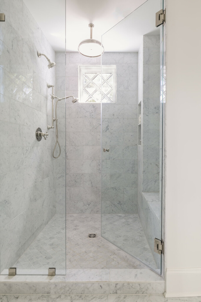
In Haverford Manor I designed a tile layout with pencil trim in a picture frame around the walls which gave it a traditional and elevated touch. But in this house I decided to let the shower hardware stand out and added a touch of natural light with the window. While this isn’t a huge shower, it does feel nice and spacious while still a useful niche and bench.
One focus in here was the lighting, something that didn’t feel like it necessarily belonged in a bathroom but still provided plenty of light. For instance the flushmount above the tub was my favorite touch of character as the cherry on top of the custom shades. And I chose the sconces that provide some depth to what otherwise could be a fairly flat wall of mirrors.
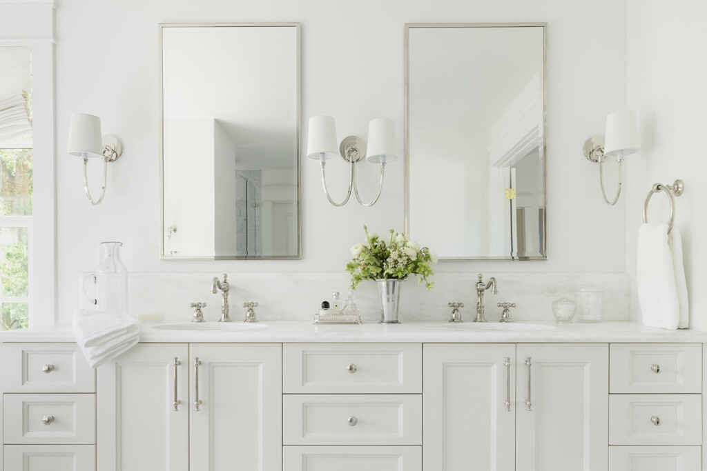
With plenty of natural light but loads of privacy with the growth in the large trees around the house this bathroom will never feel dark or cramped, especially with an almost 9 foot double vanity. I have a hard time doing normal 4 inch backsplashes so I fitted it with a 10 inch ogee edge instead, increasing the height and accenting the faucets. Overall in a bathroom like this it was the little touches of character that I think increase its character and style. Sure, we went with white cabinets and white marble but it still feels unique. While I wish we had been able to fit a little bit more storage I’m pleased with what the vanity offers and the proximity to the walk-in-closet as well.
SHOP THE ACCENTS
