BATHROOMS

A CLOSER LOOK: THE PRIMARY BATHROOM


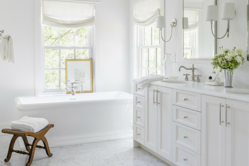
The bathrooms in my projects are where I spend so much time and thought on the design. Because I don’t get to style and decorate the homes to completion the way that I’d like, areas like the bathrooms and utility rooms are where I get to shine! And this primary bathroom in particular was everyone’s favorite.

My builder in particular kept raving about the tub! I have never heard him so excited about something, so I knew that was a good sign. And my husband said many times that it felt like a suite at the Ritz, but I’m pretty sure he just knows the way to my heart. I wanted this to feel classic and clean, but luxurious.


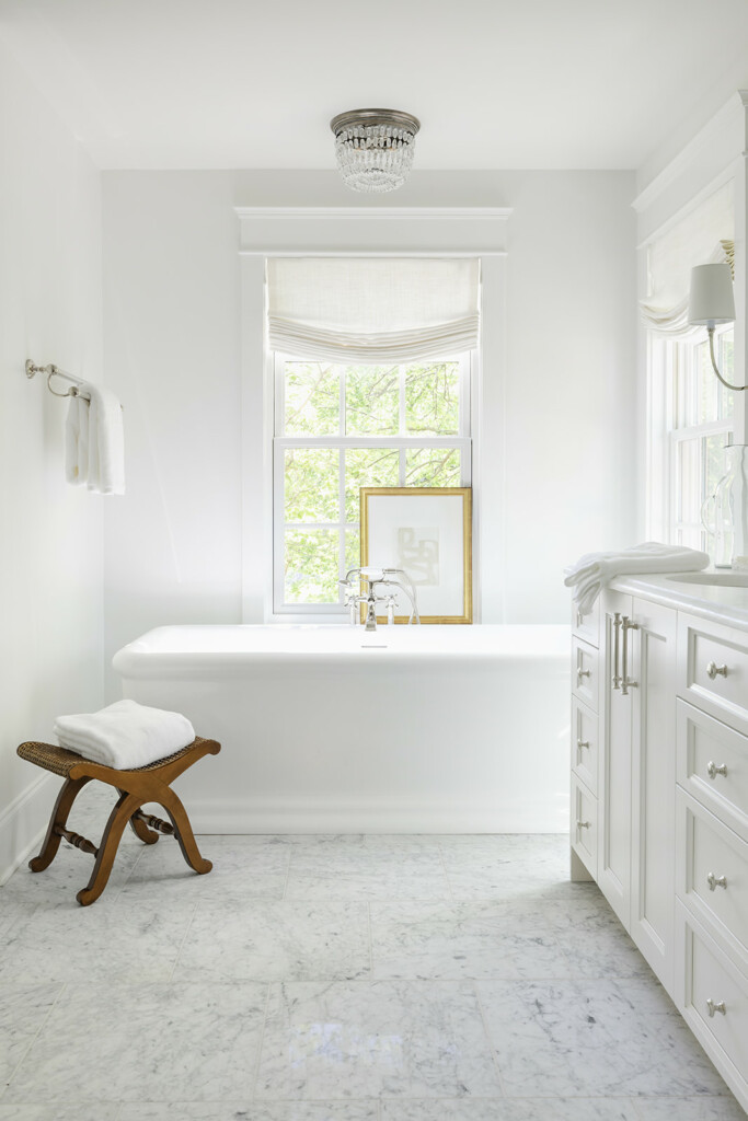
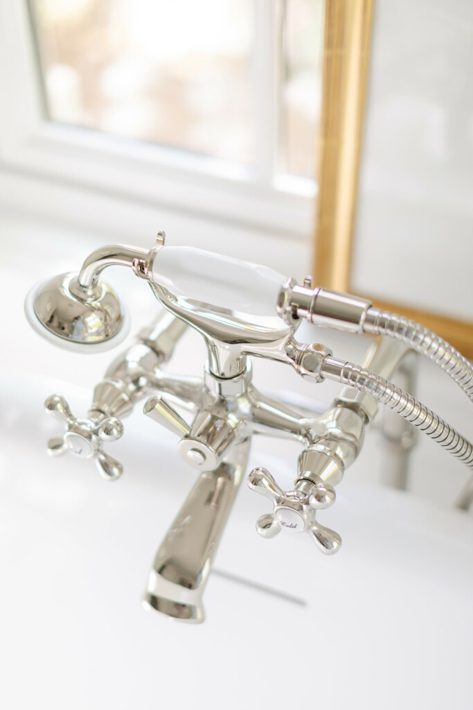
While I am the first person loving on the fact that people are embracing non-white cabinetry, there are certain areas where I think it still shines. The combination of soft white cabinetry finishes, polished nickel and soft white linens in the custom relaxed Roman shades, the layers of textures are what give the bathroom the luxurious finish we were hoping for. The classic touches come in the marble floor and traditional bathtub faucet, which I have to say is so fun!

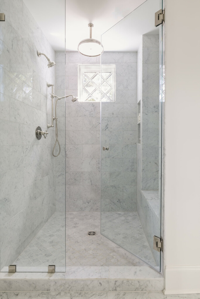
In Haverford Manor I designed a tile layout with pencil trim in a picture frame around the walls which gave it a traditional and elevated touch. But in this house I decided to let the shower hardware stand out and added a touch of natural light with the window. While this isn’t a huge shower, it does feel nice and spacious while still a useful niche and bench.


One focus in here was the lighting, something that didn’t feel like it necessarily belonged in a bathroom but still provided plenty of light. For instance the flushmount above the tub was my favorite touch of character as the cherry on top of the custom shades. And I chose the sconces that provide some depth to what otherwise could be a fairly flat wall of mirrors.


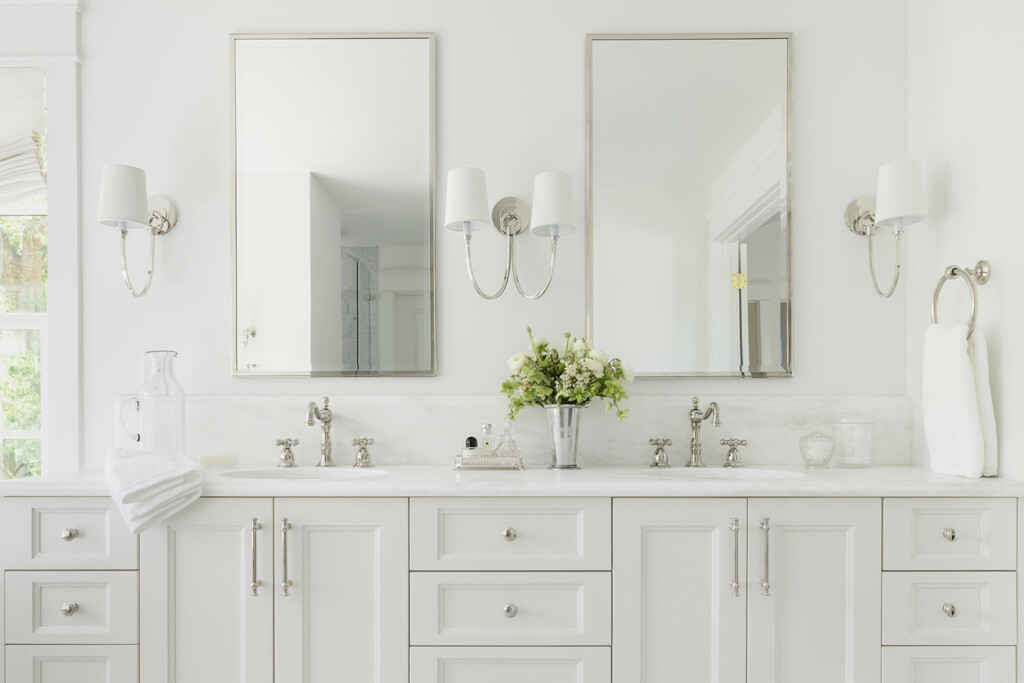
With plenty of natural light but loads of privacy with the growth in the large trees around the house this bathroom will never feel dark or cramped, especially with an almost 9 foot double vanity. I have a hard time doing normal 4 inch backsplashes so I fitted it with a 10 inch ogee edge instead, increasing the height and accenting the faucets. Overall in a bathroom like this it was the little touches of character that I think increase its character and style. Sure, we went with white cabinets and white marble but it still feels unique. While I wish we had been able to fit a little bit more storage I’m pleased with what the vanity offers and the proximity to the walk-in-closet as well.

 SHOP THE ACCENTS


PROJECTS

INTRODUCING WOODVALE MANOR


Yup, we did it again!

I had been on the hunt for months before finding this cutie and instantly fell in love with it. To be honest I was really unsure we were going to be able to find another one after we lost a historical find that I loved, but this one has its own beautiful charm. Built in the 1930’s, it has great bones and is in shockingly great shape for its age!

Plus, the view from the front is absolutely adorable.


This courtyard had me swooning, and thankfully we are able to make updates to the footprint without losing it. While it currently stands at under 2,000 square feet, we know that for a better resale we need to make it closer to 4,000 square feet. Right now we’re thinking we can make it almost 4,200 by adding on to the back, and attaching a two-car garage.

It already has a cottage feel to it and I want to stay true to that in the renovations. And with over doubling the space I’ll have plenty of opportunity to enhance that with finishes. But, we actually closed back in August so not only have I had tons of time to think over the concepts but we have already made some progress on it that I’ll be excited to share soon.


Like I said, so much character! To give you a little idea as to what’ll be doing…

  • the front will stay pretty much the same! While she’ll need a coat of paint and new windows, the biggest change will be the location of the front door. Instead of hiding it to the side (like it is now) we’re going to bring it front and center!
  • The footprint will actually change drastically! Taking down the detached garage and adding an attached 2-car garage with space above it as well as bumping the back exterior wall out quite a bit. Unfortunately that means losing the darling screened in porch, but hopefully we’ll make up for it with a great new outdoor space.
  • Because we are bumping the back wall out we’ll be making room for a great kitchen and living space. While the house will be bigger and still feel completely different I really want to lean into the cottage feel on this one to enhance its original character.
  • That living room pictured above will get enough of a facelift to feel like a new space but honoring what is existing. Keeping the fireplace mantel but upgrading it with a new paint color and surround. I also think we need some fancy lights in here too, what do you think?

Up next? We’ll be sharing more of the plans that we worked on super diligently to make sure that we maximized the space but also made it feel like the floor plan was always planned that way and felt familiar, but also completely different. That doesn’t sound too hard, right?

Stay tuned!


This error message is only visible to WordPress admins
Error: Access Token is not valid or has expired. Feed will not update.