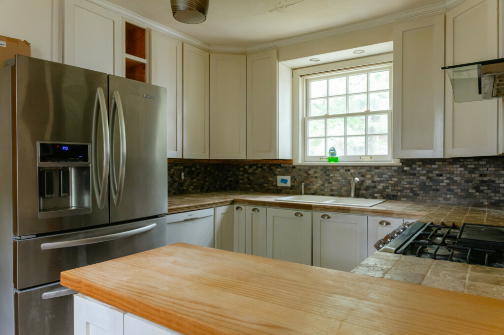
Relocating this kitchen was a no-brainer.
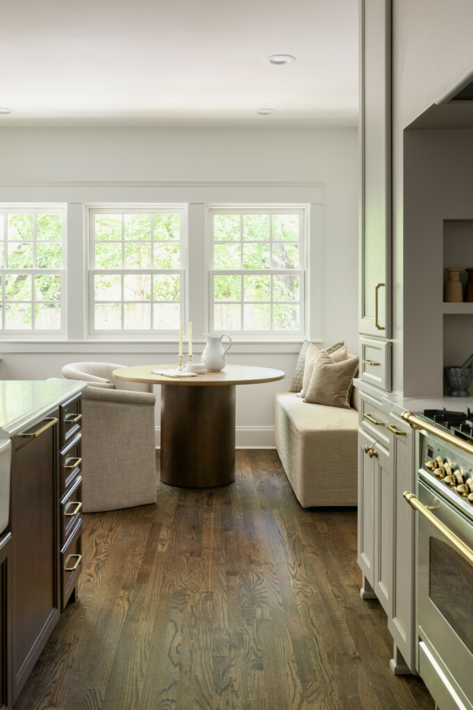
We took in the old side door entry, and powder room/laundry room and turned that into a larger, open floor plan kitchen and living room. Now this old space where the kitchen used to be is a walk-in pantry and laundry + mudroom so not only were we able to update the kitchen but also add more function to the first floor in its entirety.
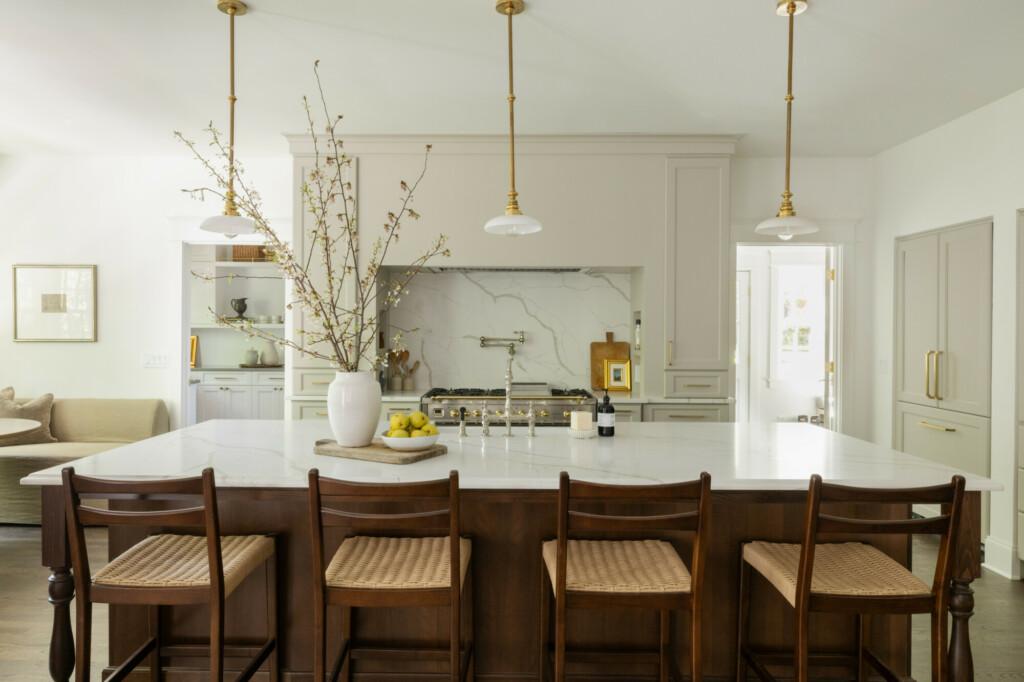
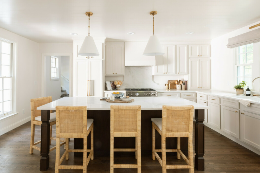
The designs for the new kitchen came together really quickly and were easy to visualize. Not because it’s a smaller house or a smaller kitchen than I’ve designed in the past, but because I had in my mind exactly how I wanted it to look right from the beginning. This designs as a whole came together quickly but I felt like this kitchen and living room space was an easy space to accentuate the overall style and feel of the home: luxury coastal cottage. With v-groove trim on the ceiling and soft taupe cabinetry, I wanted the space to feel open and light, but with a touch of warmth and texture.
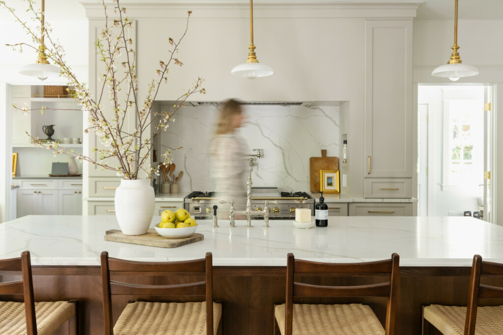
Like other projects I went with a contrasting island in a stain, but added extra seating on one end of the island. So if you don’t have room for a kitchen table, you have more seating available here. While it’s not a huge island (unlike the 10 footer we had in Woodvale Manor), it still has a good amount of storage with a built in microwave, plus some beautiful posts to support the extra counter overhang and add character.
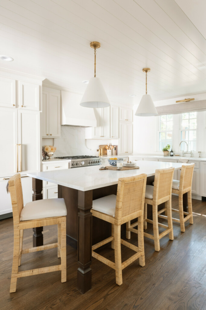
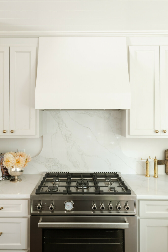
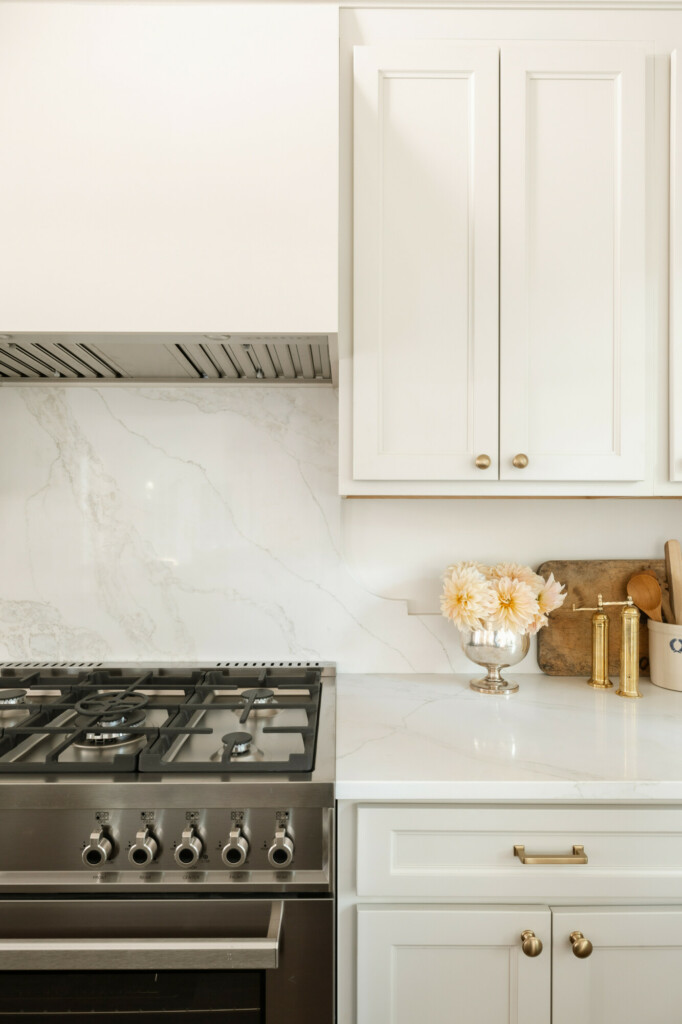
I think I have a new favorite countertop material! I went back and forth, but ended up choosing Starlight Quartz because of the taupe-like hues and beautiful grains that emulated real stone. I love how it looks on the island by itself, but cannot believe how well the range backsplash turned out. I really went for it here because I wanted to do something different than just a plain full backsplash across the entire wall. I love how the shape adds a touch of character and dimension as well as how it keeps this space feeling lighter. While I’m not a huge fan of tile backsplash in a kitchen, I am warming up to it. But if I had to choose between something like this, and tile? I’d choose this beauty all day long
Anchoring the range and this perimeter cabinetry is the kitchen hood that I got from Hoodsly. The second time I’ve used them and just like Haverford Manor, they did not disappoint. I went with the Sloped Hood Without Trim so that it could blend into the cabinetry seamlessly. I loved the sloped with trim that we used last time because it could stand alone and felt that it needed the trim to not get lost in the design, but this design’s simplicity blended beautifully with the whole kitchen while featuring a beautiful slope detail. They have loads of beautiful styles to choose from and you can use code MANOR15 for a discount if you choose Hoodsly for your next kitchen project!
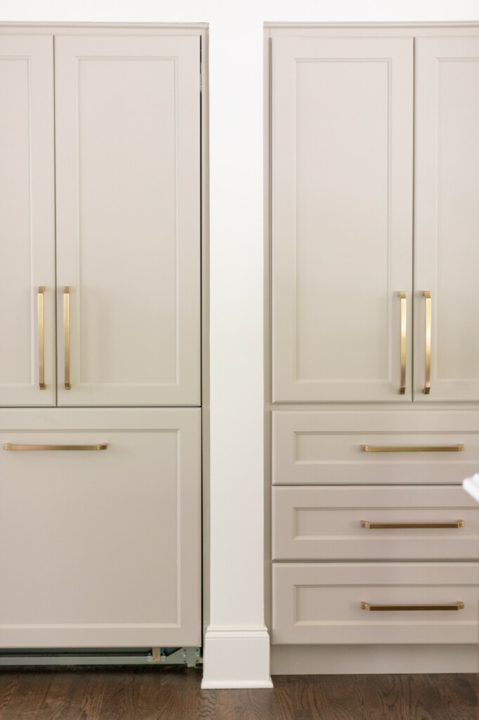
One aspect I knew I wanted to include was a counter to ceiling cabinet in the corner to anchor the space. With the fridge on the left I didn’t want the space to feel unbalanced, plus I love having different layers of upper cabinets and we were able to include an outlet in the bottom shelf so you can use this as a coffee cabinet and keep those small appliances off your countertop. We had something similar in our kitchen in Minneapolis and that’s where my beloved Keurig machine would go, and I loved not having to look at it everyday but knowing it was easily accessible.
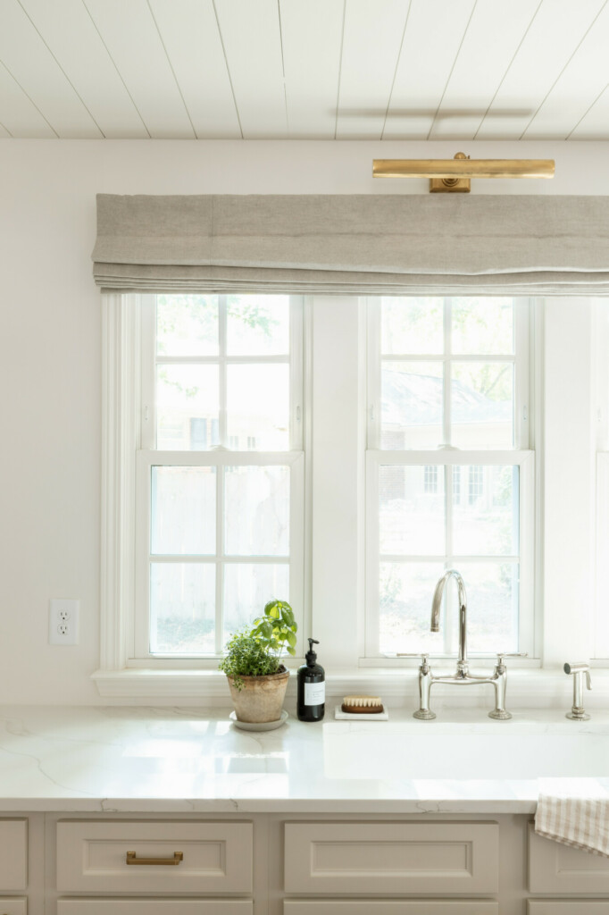
And you all know I love “a moment”. This sink vignette above was one I was really looking forward to. This is actually the first non-island sink that I designed and I kind of love it! We added this window set to not only give loads more natural light, but also give you a lookout from the sink, and I wanted the window to be prettier than just a normal window. I wanted to add more light above the sink as well as give it a designer touch, so I added a portrait light in a warm brass finish, as well as a custom linen Roman shade. This isn’t just for function but also to add a softness in the textiles in an otherwise cold and hard space like a kitchen.
SOURCES
Perimeter Cabinetry Color: Sherwin Williams Taupe of the Morning
Countertops: Starlight Quartz
Cabinet Knobs: Top Knobs Dakota 1 1/4 inch Mushroom Cabinet Knob
Cabinet Pulls: Top Knobs Ascendra Pull
Bridge Faucet: Edalyn by Studio McGee Bridge Faucet with sprayer
Island Pendants: Goodman Small Hanging Light
Portrait Light: Cabinet Maker’s Picture Light
Roman Shades: Everhem Flat Roman Shade in Birch Linen

