I don’t think I realized how crucial light fixtures would be in a flip before I built Haverford Manor. The character and details have to appeal to a large demographic so while I’d like to do trim and wallpaper all over the house, that’s not exactly the best route. So the light fixtures not only have to stand out in regards to design but also the ability to envision the furnishings and complete picture. And every single light fixture selection in Haverford Manor was intentional and thought out, so I thought we’d take a closer look.
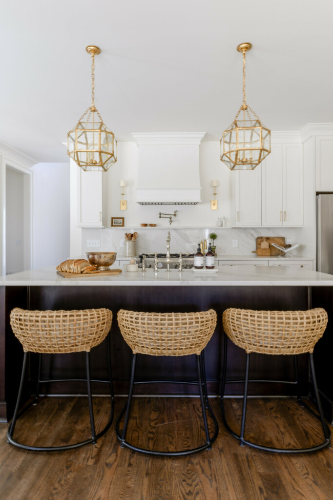
The overall designs of the house was warm and neutral and we accomplished that with warm finishes like brass and gilded iron. There are several different finishes in bathrooms like polished nickel and some iron accents but in general stayed with brass.
And I wanted to make sure that even the small areas were taken care of. I didn’t want a whole wall of cabinets when you looked back from the living room, so instead of inserting the hood between those cabinets, I opened it up and added more lighting with these sconces. Kitchens are a naturally colder place because of the appliances and countertops so I wanted to make sure the lighting counteracted that, creating a warm place to gather as a family.
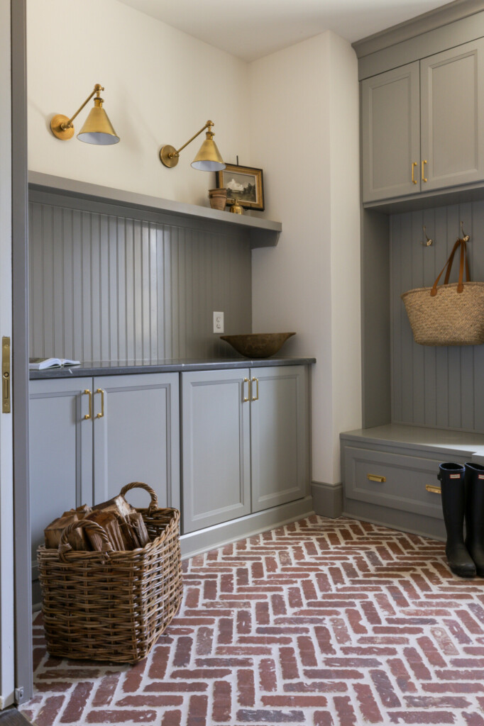
Then there were other areas like the mudroom (or as we called it the Boot Room) where I got to have a little fun. Sure we could have thrown a ton of recessed lights in here and been done with it, but that’s too boring. And since this area was a nice size, I was able to incorporate several different styles, including the library light pictured above. And when we hung the flush mount (in size grande) my GC said “now that’s a statement”. Add that with the vintage artwork and portrait light above the sink and you have a glorious mudroom!
SHOP THE MUDROOM
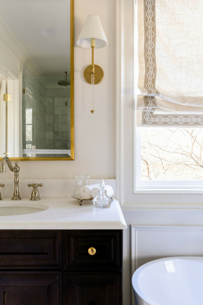
I spent so much time designing the bathrooms, mostly because it was an amazing opportunity to show off some style! And lighting was a huge component of that. Once I had the tile selected, next was the lighting. While every bathroom is a little different, there is a consistent transitional and classic style to each of them. I brought the same fixture from the kitchen as a focal point in the primary bathroom, but with frosted glass. It paired so beautifully with the custom shades we had installed and we were so pleased with the end result.
SHOP THE BATHROOMS
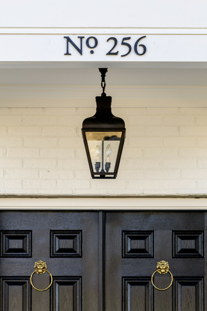
And last, but certainly not least, are the exterior lights! I certainly hope people don’t think of these last because it can be such an easy way to elevate your curbside appeal. I wanted a focal point above the front door, and matched them with the wall lanterns above the garage doors as well as the ones above the patio doors. Fun wall sconces or even gas lanterns are an amazing way to instantly elevate your exterior game, and it illuminates the beautiful exterior of your home! Making everything pop. I mean, just look at that lantern/house number combo!
SHOP THE EXTERIOR
So if you’re wanting to redo something in your home, but not looking to do any big construction, start with your light fixtures. A room that relies solely on recessed lights is going to feel builder grade and colder than one with a beautiful light fixture. It can be a focal point in your room and bring together all of your beautiful furnishings and decor.


