Seeing as I don’t get to furnish or really decorate these houses the way that I have dreamed in my head for 18 months of working on it, I make sure that I go really big when I can. Bathrooms and utility areas (while some people overlook and find boring), are a great place to show off character and design. I just cringe when builders leave a laundry room empty with everything but the washer/dryer and a sink, or when they have a great sized bathroom and they just do white subway tile and a glass shower door… come on! Get creative!
I absolutely love selecting tile because for me, it’s a bigger process; matching the trim color, or maybe a window shade, or contrasting the floor tile! The options are endless and you can really give (what otherwise might be a boring space) a ton of life.
I went pretty traditional in Haverford Manor: marble and neutrals. And while you can’t go wrong with those classics, Woodvale Manor had a sense of character and color from the start that I wanted to lean into. It was the cottage vibe that I wanted to evoke, but instead of lots of patterns (that lots of people might not like) I decided to go with subtle colors and details.
Bathroom No. 1
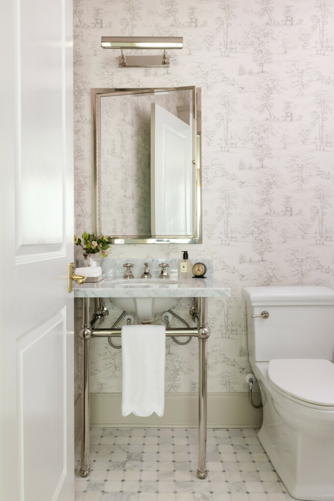
The downstairs guest bathroom was very small, but I knew what I wanted from the very beginning in this space and I never wavered. The mosaic floor tile was complimented by the shower wall Carrara tile for a classic and timeless look that I then paired with a toile wallpaper. And instead of a regular mirror I went with a polished nickel recessed medicine cabinet for extra storage (again, a small space), and instead of a regular wall sconce I went with a portrait light.
And another great way to add character is a unique shower curtain! The one I chose for this bathroom matched the hand toile with a scallop detail which I thought was so fun.
Bathroom No. 2
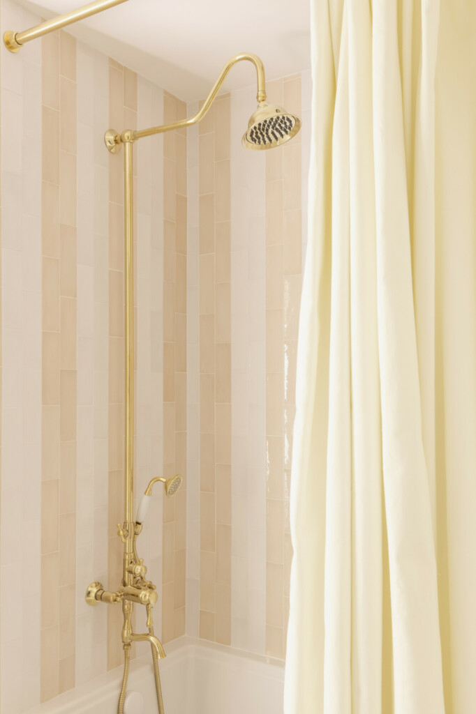
This bathroom belonged to my favorite guest room in the house. While it was the smallest, it had the adorable diamond grilles windows, loads of angled ceilings, and two hidden storage closets that would be perfect for a little kid hideaway. So, I made the bathroom just as adorable!
You can’t beat stripes, pretty much anywhere they are a classic and timeless pattern, so I chose to do that with the tile too! In fact the darker tile is the same that I used in the Jack + Jill at Haverford Manor, but I thought it was a perfect neutral to try out these vertical stripes for the first time.
Plus, any tile that has an exposed brass shower hardware is pretty much the most amazing bathroom.
Bathroom No. 3
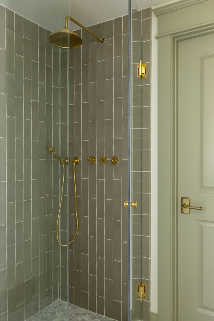
I’m living in my green era, and I loved the paint color I used on the trim in the powder room so much (Farrow & Ball French Gray) that I wanted to use it again. This tile was a beyond perfect match so I went for it. Nothing too special with the application but I loved the pairing with the brass hardware so much.
Besides, green is a neutral!
One thing I highly recommend is using your shower hardware as more than just function. Use it to pop or accentuate a tile color that you have in the bathroom. It doesn’t always have to be boring polished chrome, just because. I love how this unlacquered brass pops off of the green. Just because something serves an important function doesn’t mean it can’t be a design decision as well.
Bathroom No. 4
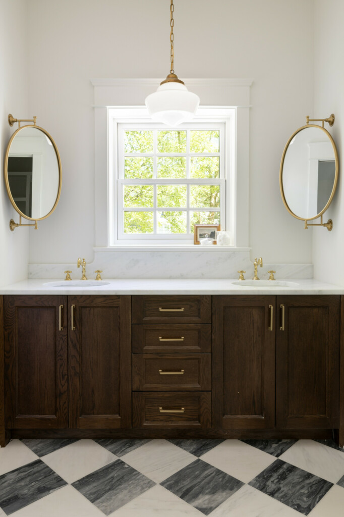
Everyone’s favorite bedroom had a pretty special bathroom too. While this room would be ideal for a cool bunk room or a long term guest, this bathroom suits all those needs. My architect really wanted to avoid the window at all costs but I said no way! We’ve got to use it! So placing the vanity in front of the window offered a unique design and nice natural light.
I did a checkered tile in the Haverford Manor laundry room with a ceramic tile, but I decided to go fancier for this space. Bardiglio Gray tile paired with Carrara Pietra Marble 12” x 12” laid in a diamond checkered pattern was a beautiful selection and I’m so happy we went for it.
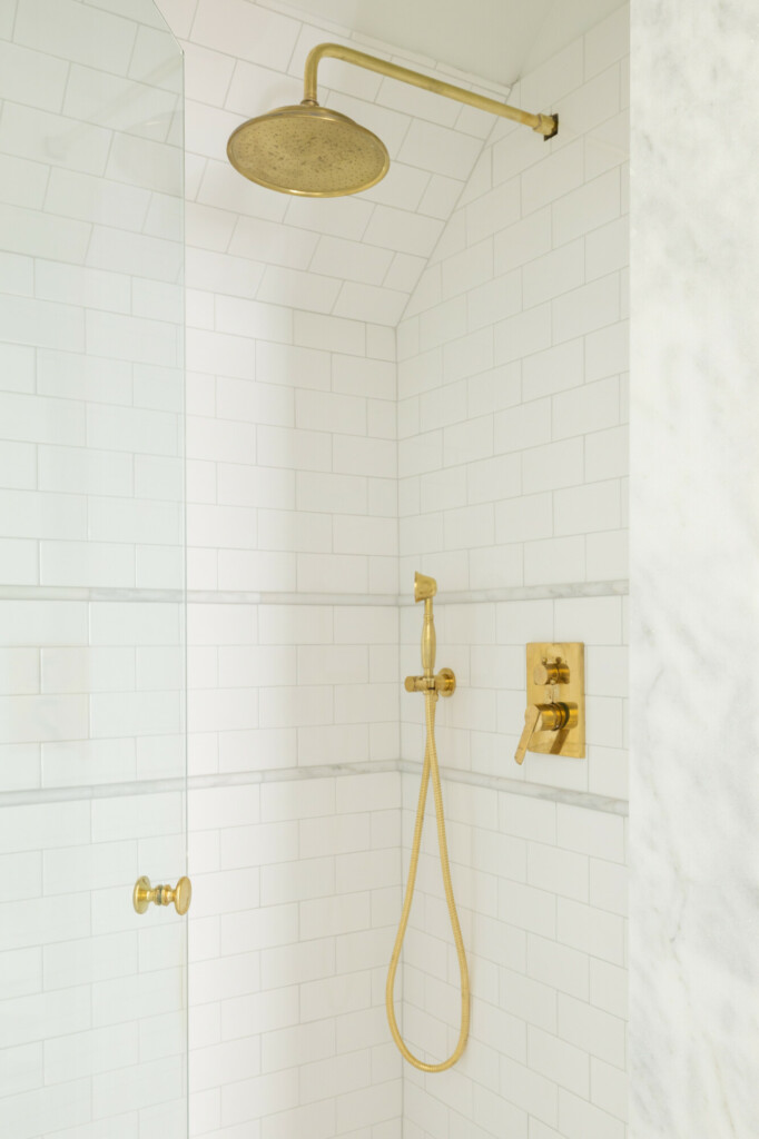
Due to budget we had to switch out the original marble tile in this shower with simpler white ceramic. But you know we couldn’t just keep that basic tile in there alone, so we threw in a Carrara pencil border to accent the niche and the hardware. I’m obsessed
I think small touches like this can make a huge difference in what otherwise might be a boring space. Don’t want to do the marble pencil? Do a ceramic chair rail! Just because it’s subway tile doesn’t mean it has to be plain. Another way to instantly elevate a shower is to use marble slabs at the shower opening instead of tile. Don’t want to go to a stone yard for this? You can find threshold pieces at Lowe’s and other stores to cut down if you need to.
I think my next project I might try a shower wall with a small square ceramic checkered tile layout! Stay tuned!


