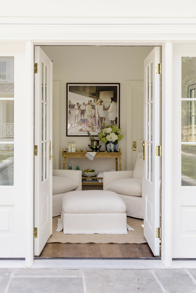
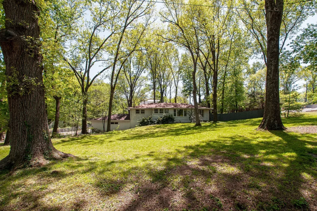
INSIDE OUR PLANS FOR WEST MEADE MANOR
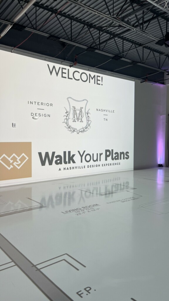
Taking this house from 2,300 square feet and a single story to two stories over 6,200 square feet, 6 beds and 6.5 baths with a dedicated office and a rec room and three-car garage means a whole lot of work on the plans. We’ve been working hard on the plans for the last few months and had an awesome opportunity to work with Walk Your Plans Nashville to make sure they were absolutely perfect. Being able to actually walk the floor plans to scale was an amazing experience. Just an hour with my builder and architect and we made some incredible changes that we wouldn’t have been able to catch until it was too late, and the features they have at Walk Your Plans, like VR goggles to be able to literally walk through a house is way too tempting to pass up.
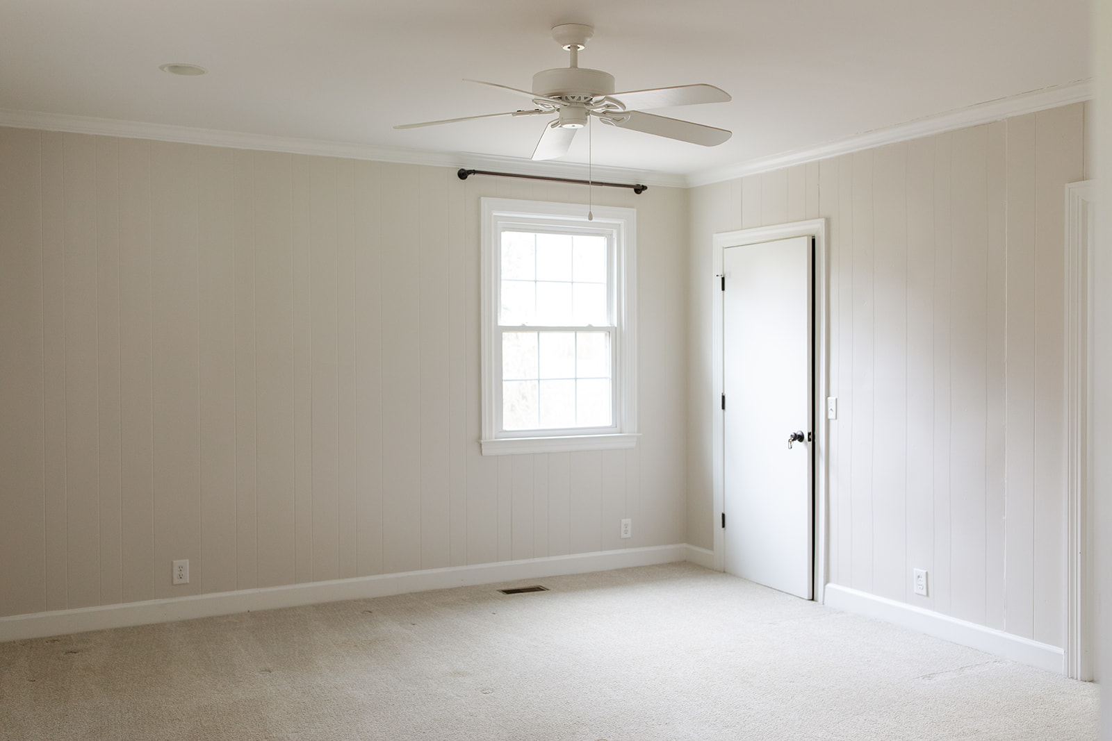
One of the biggest benefits of our time at Walk Your Plans was being able to see things to scale. Plans can look great on paper, but then feel off in real life. And with Walk Your Plans Nashville, we get to experience the house because taking a hammer to anything. And when I tell you we made some much needed adjustments, that is with complete honesty and relief! Because I know when we got to framing and/or drywall I would have felt the need for changes, which, would just end up costing the project more time and money and is the last thing you want to waste in this business.
The biggest catch?
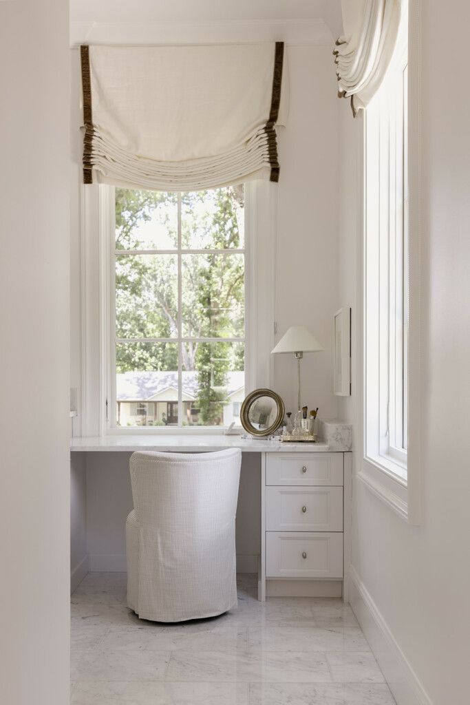
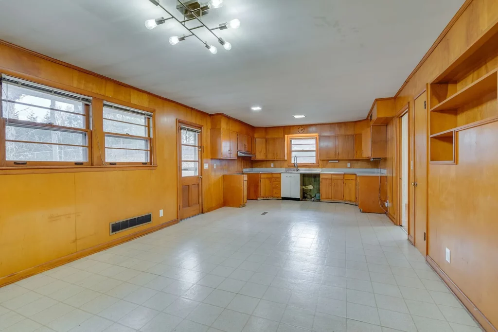
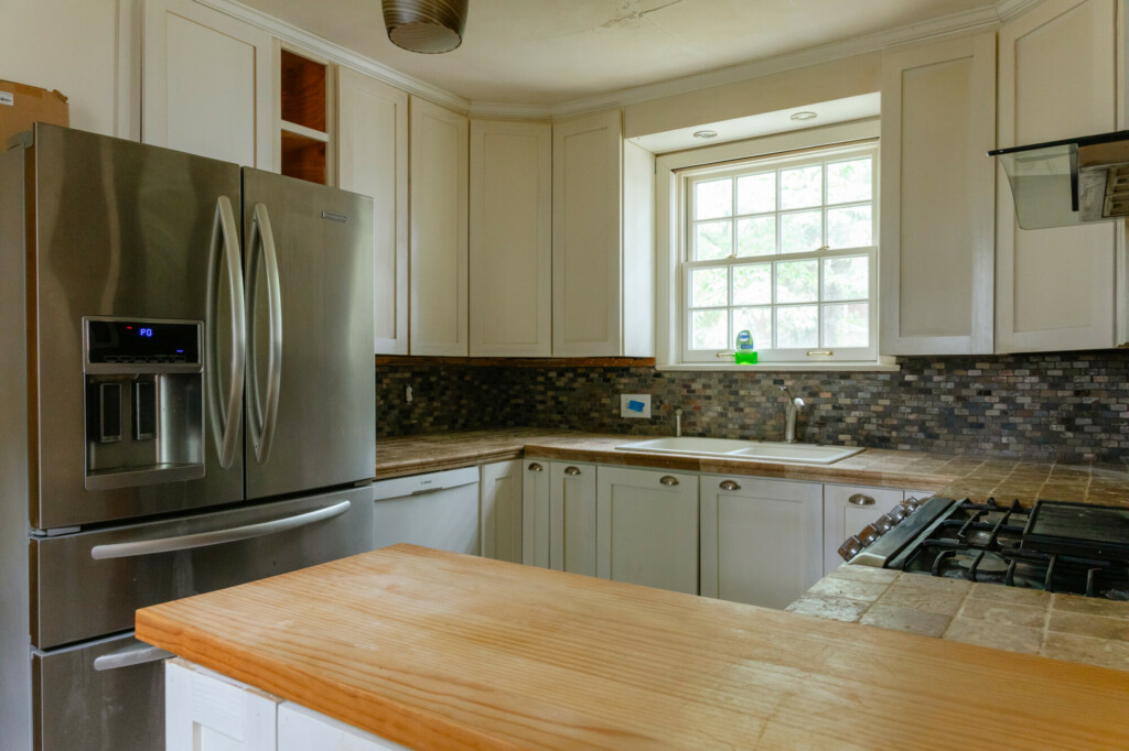
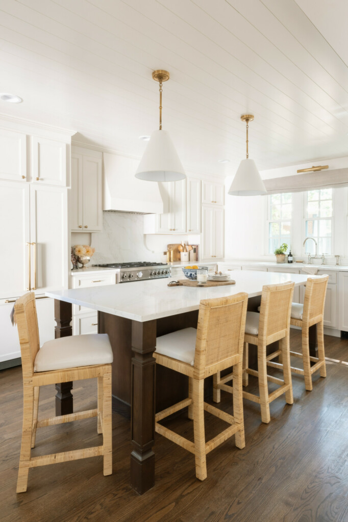
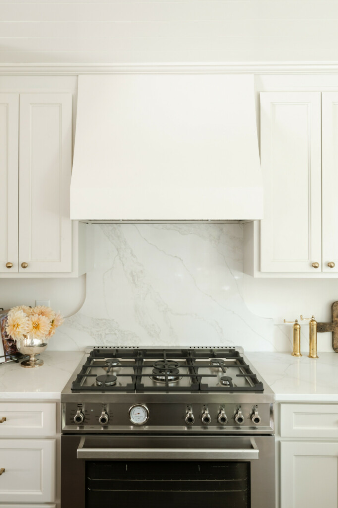
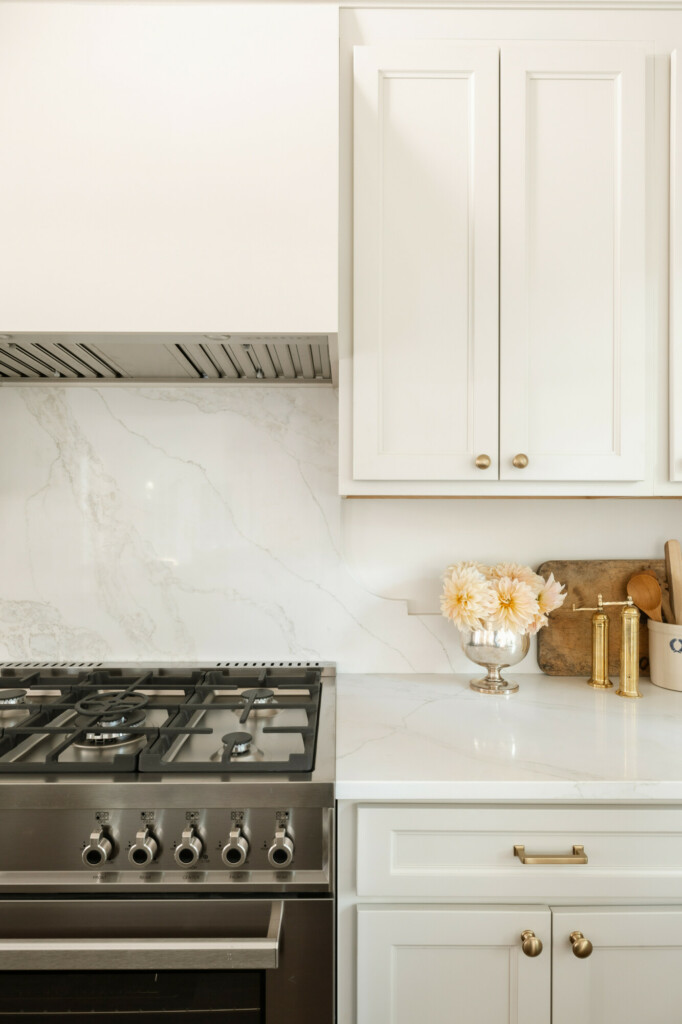
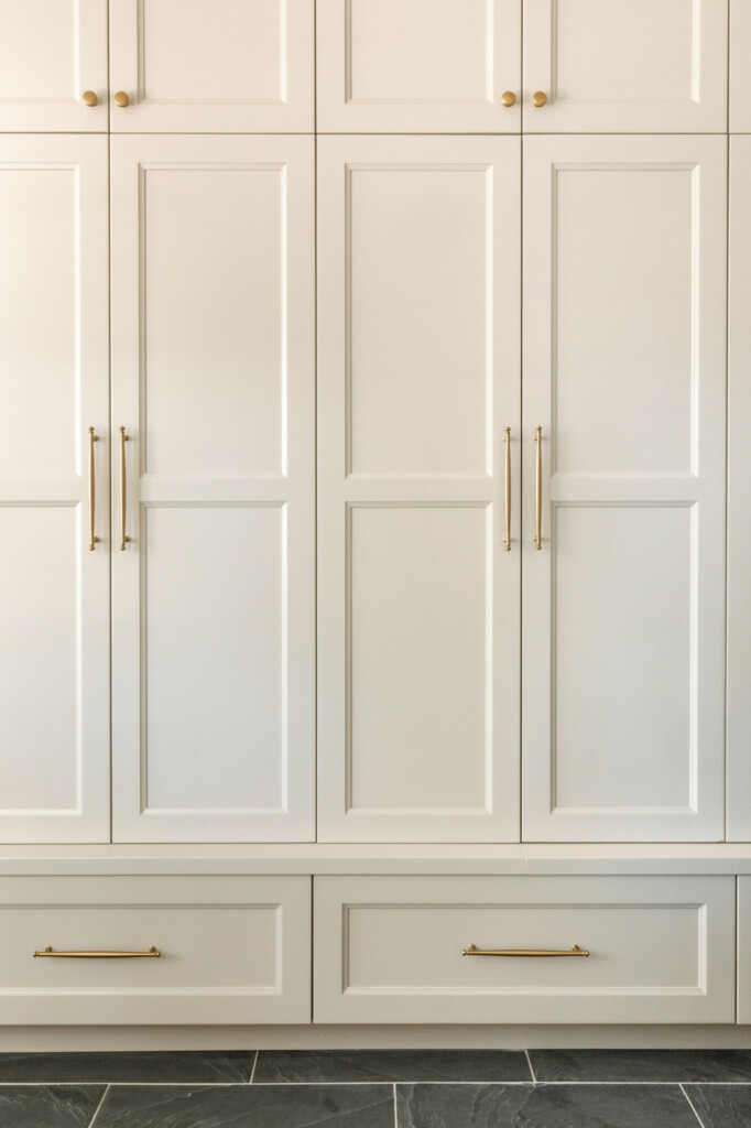
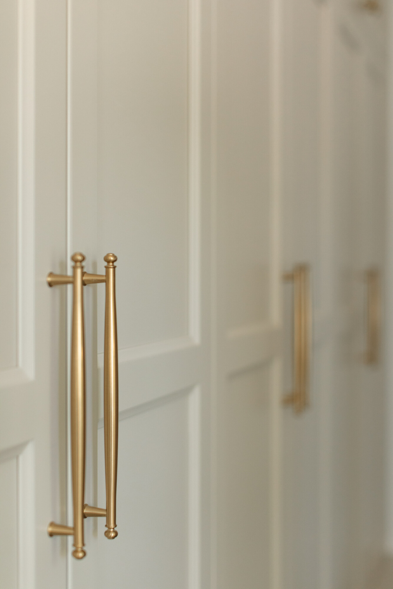
The kitchen! Before, it felt much too small for a house of this size, and if I felt that I know any number of potential buyers would have as well. So we were able to push the fridge and door into the pantry to recess into the wall so while the pantry got a little smaller, the main area of the kitchen increased. That also means that the island got larger which instantly makes the entire room feel bigger. Not to mention the extra cabinet space surrounding the kitchen.
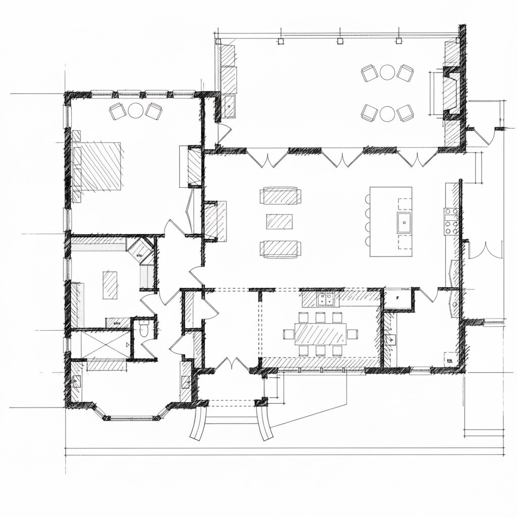
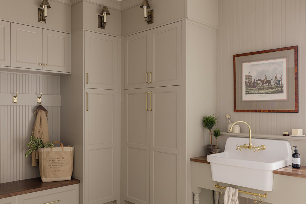
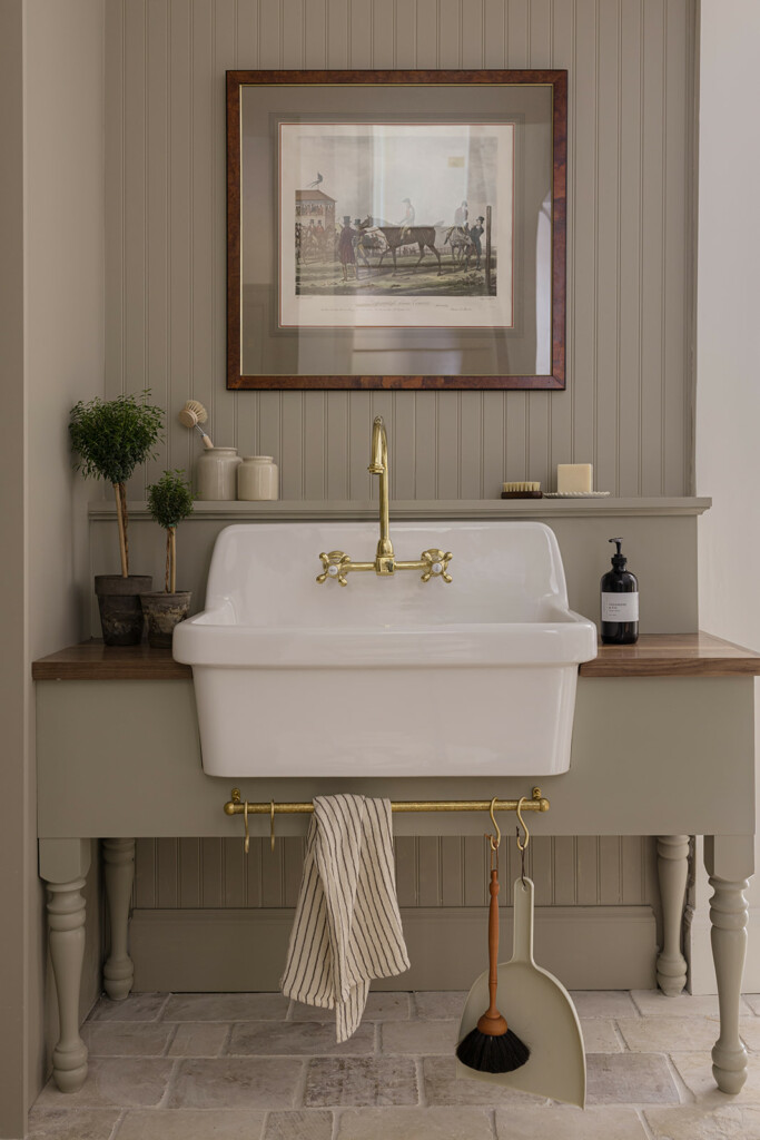
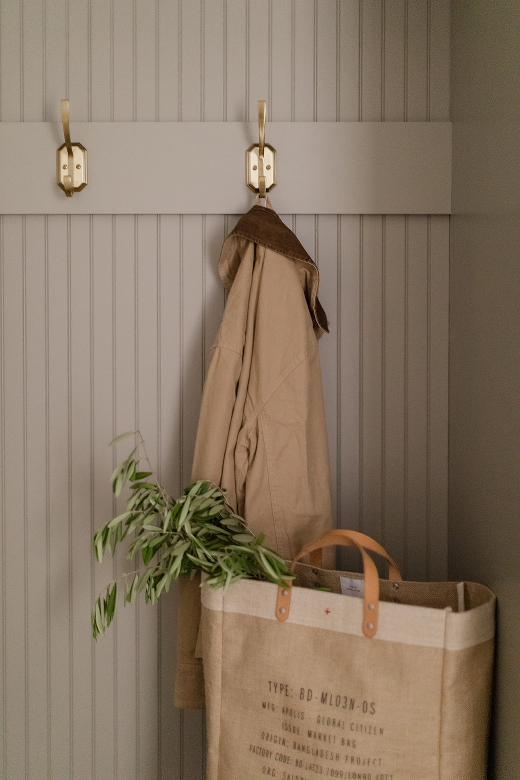
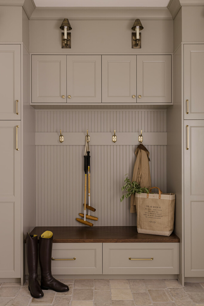
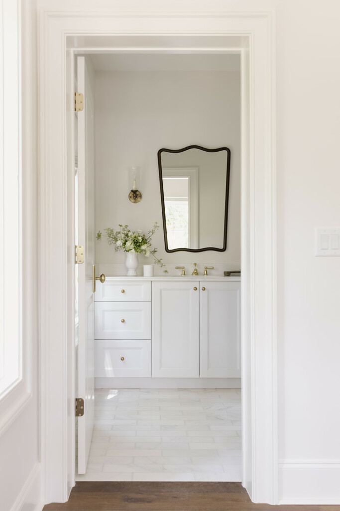
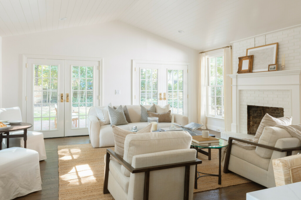
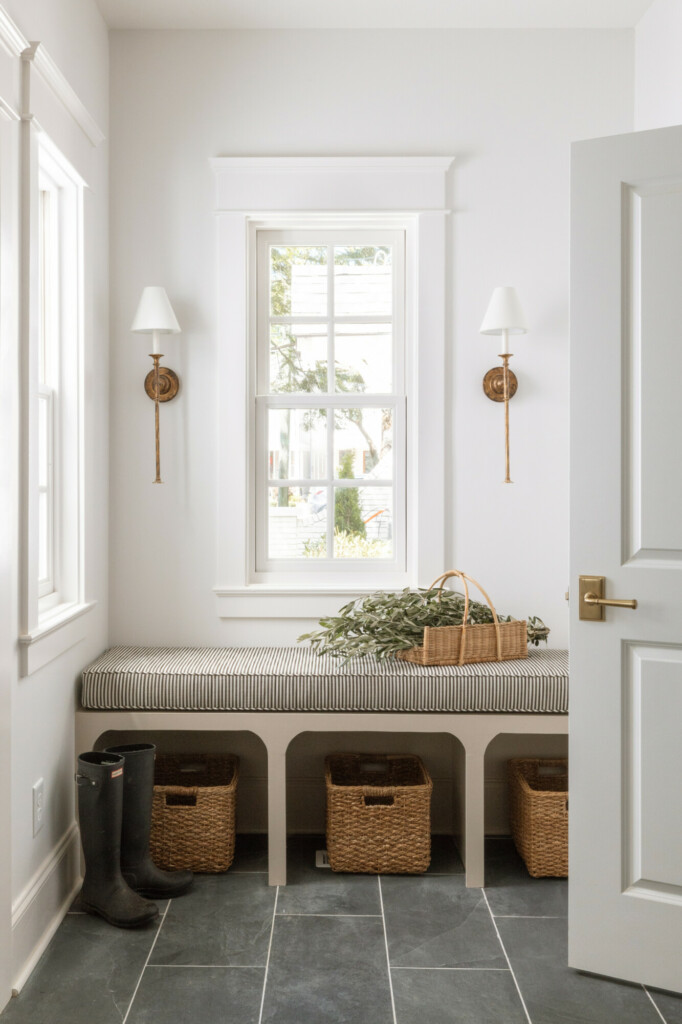
A simple tweak of bumping a wall by the back door meant that we were able to rotate the powder room and make the entire mudroom larger. Something we never would have caught without the ability to stand WITHIN the plans. One of my main goals going into the day was to make sure we figured out how to make the entrance into the living room from the foyer larger, and centered. And you know what? We did! We were even able to making the living room larger, which, in this business is a huge plus.
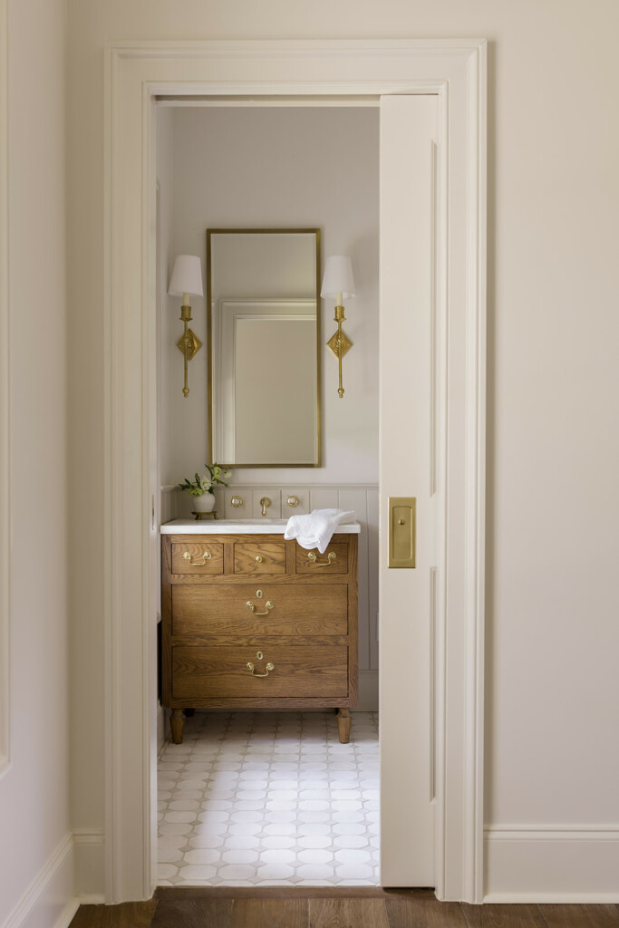
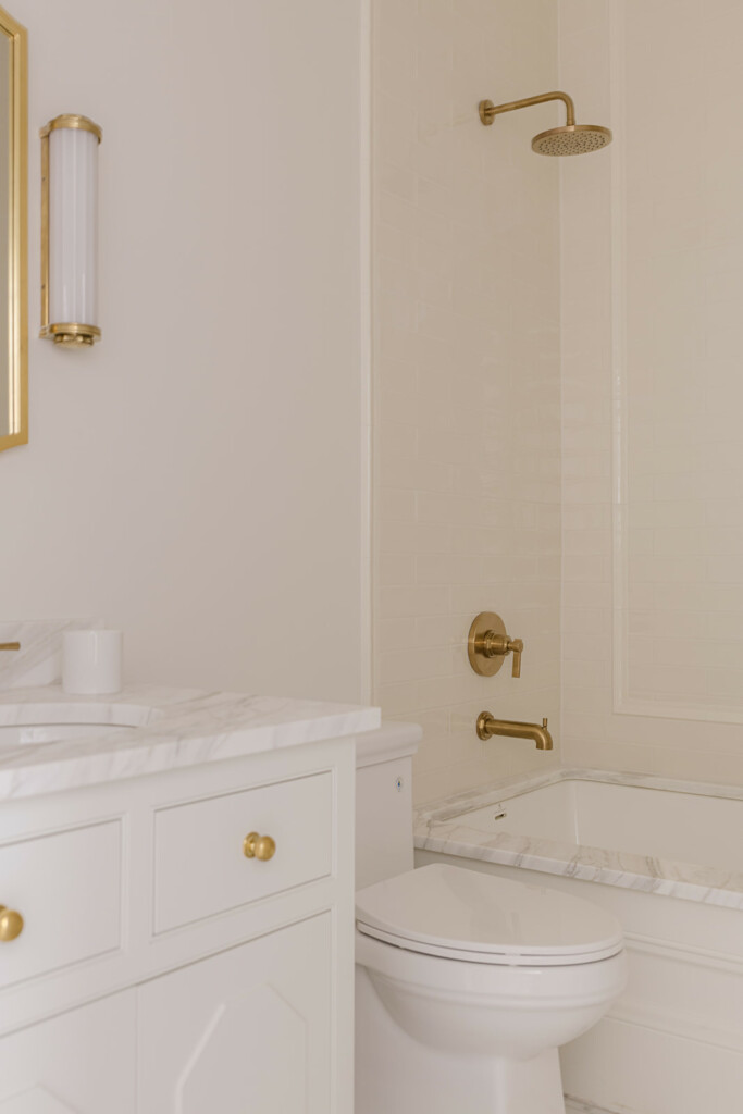
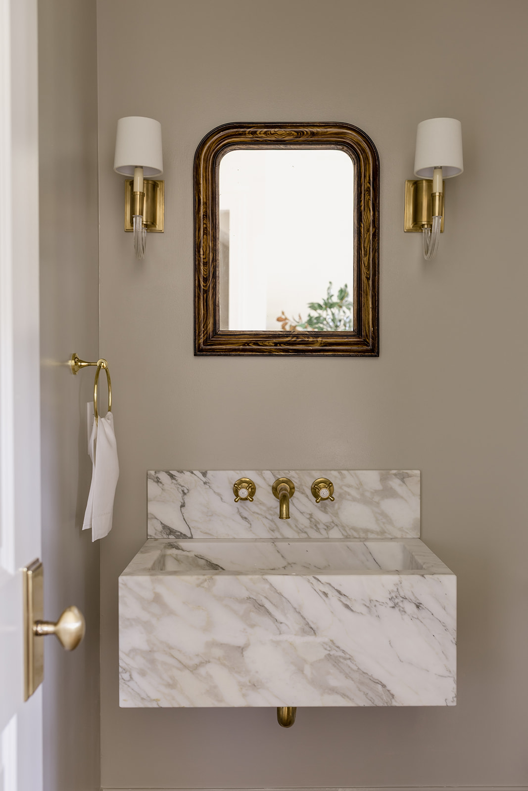
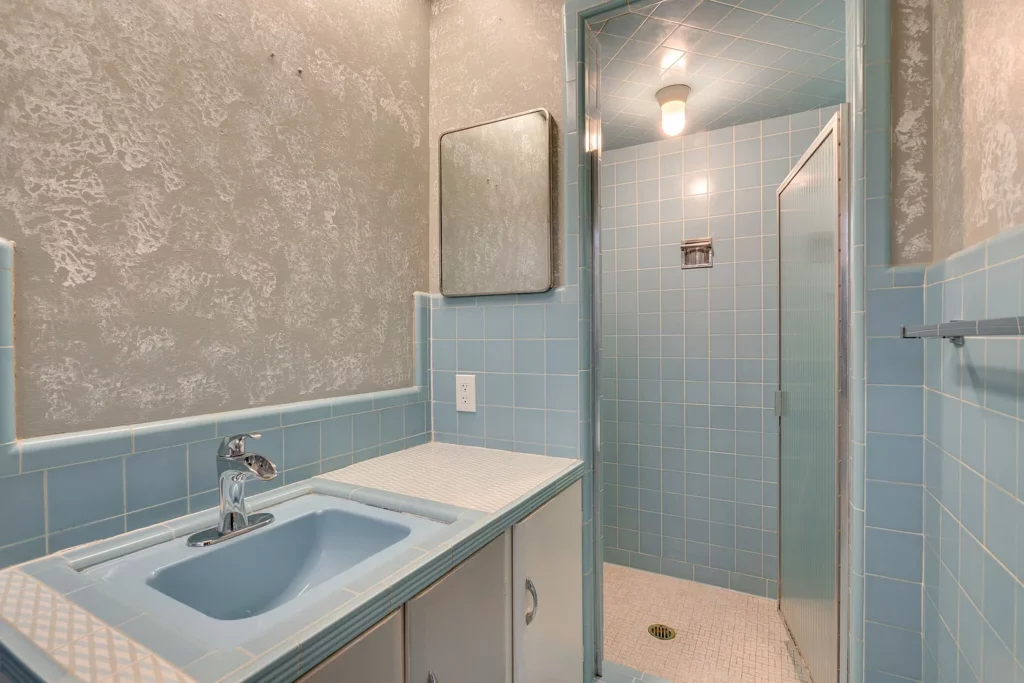
Something incredibly helpful for my builder and architect was to be able to mark up the plans with their digital screen to find the perfect spot for the fireplace flues. Because they sit on the same wall it takes some coordinating on the second level to make sure we aren’t coming up in the way of anything. So we were able to find the space we needed, as well as design a pretty cool bathroom around it on the second floor as well. Walk Your Plans makes everything so easy during your time there, and even after they send you the notes document with all of your markups so you can leave knowing that all of the progress you made will come with you.
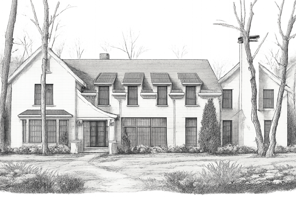
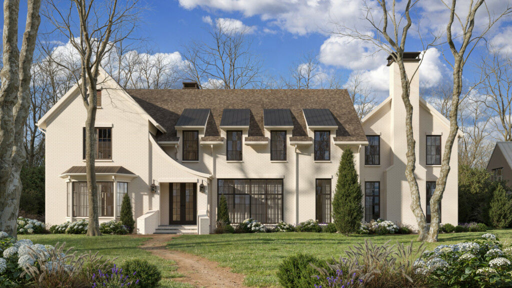
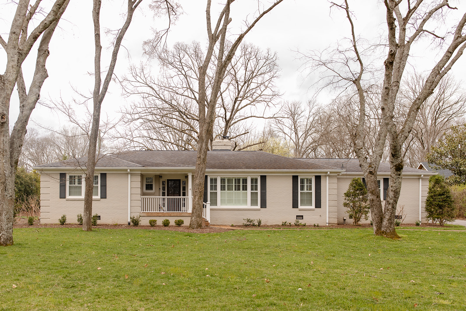
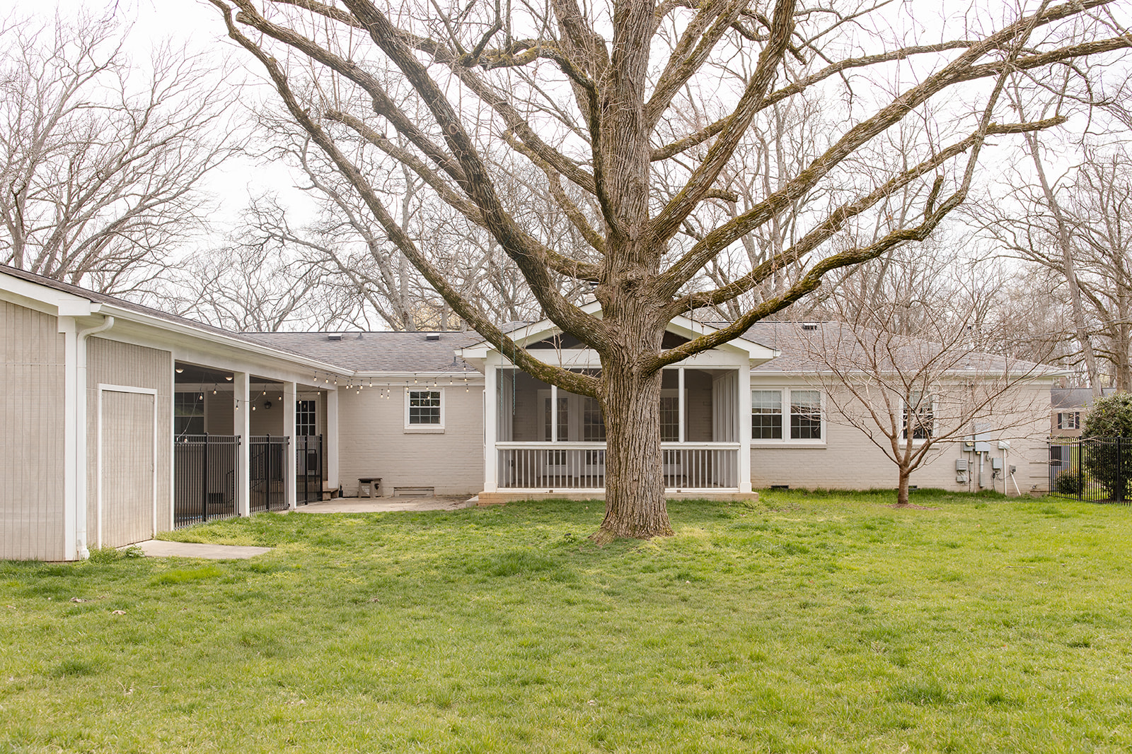
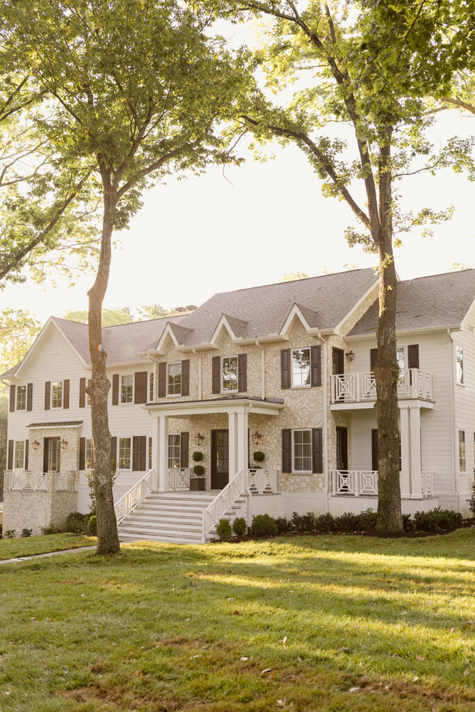
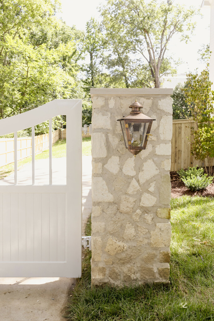
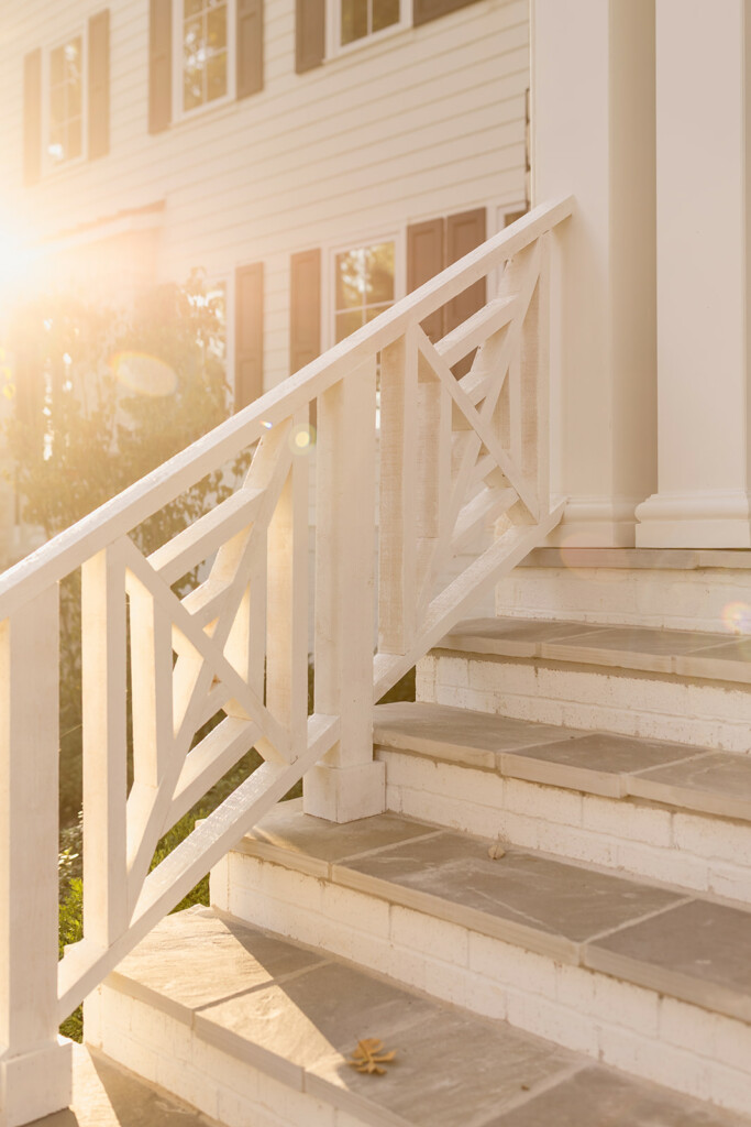
One thing that took us an extra long time throughout the entire design process was the exterior. And by ‘us’, I mean me. I was having the toughest time figuring out how to make a house this long feel like it made sense but also fit in with the other houses on the street. There are so many new construction builder homes that are going up that have the exact same style and color, which isn’t what I do. I wanted the house to have a unique identity from the outside, as well as the inside. So I went with a softer white than normal, a more neutral roof color than usual, and a few added modern touches like iron statement entry doors and black windows.
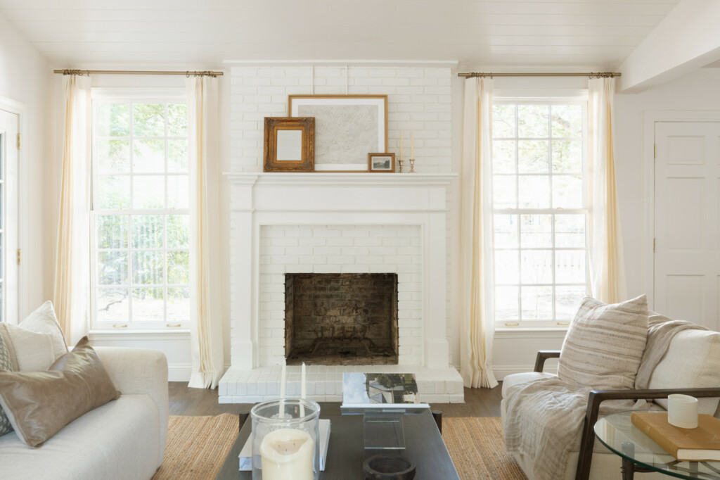
Your home’s design should feel like it could stand the test of time. So adding anything too trendy that you’ll feel like you need to replace in 10 years is not the goal. In this house I’m looking to add some interior touches that feel a bit less traditional than the past homes I’ve designed but I’m not going to modern by any means. I’m calling it “new traditional”, holding firm to my traditional roots but adding a few touches here and there and we kicked that off with the exterior design.
I can’t wait to share the progress with you and have more behind-the-scenes stuff planned, so stay tuned. Most of the project updates, including design selections and renderings will be on our social media or Substack so be sure to check back there for all the behind-the-scenes fun as this project progresses.
*All images are image ©️Manor Designs. Images may not be used, reproduced, or distributed without written permission


