I think this is my favorite transformation of the entire house, let me explain.
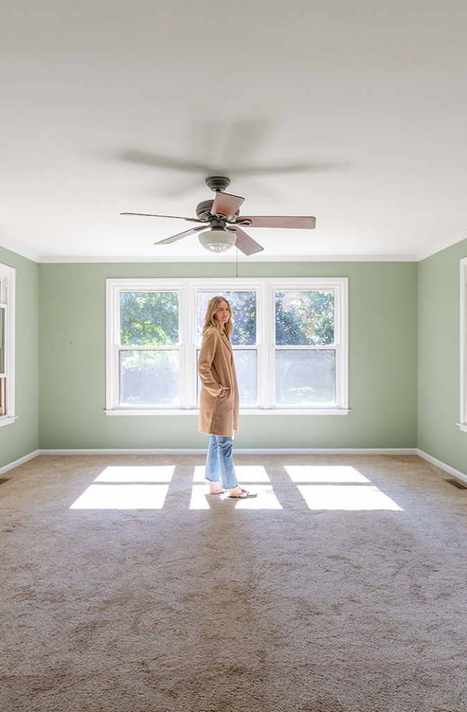
This room stayed the exact same in size and location. Seriously! We knew the size of the room was plenty for a great living area and that the flow into the covered porch would work beautifully with French doors. Sure we could have had more square footage by continuing the second floor above this room, but come on, those vaulted ceilings? That’s a dramatic moment I didn’t want to miss. But let’s just do a quick side by side shall we?
Ya, loads better. And that’s not even to mention the horrible smell of dog from the carpet.
What you can’t see from the before picture is that the photo was taken from the old dining area, now the kitchen. And while that flow worked well for us, it was closed in a bit with walls and a large cased opening going into the living room. It was amazing how much bigger the whole space was when we simple opened up the entire opening to the room, taking down that drywall and cased opening. It completely opened up the space to what is now the kitchen making it flow much better and an open concept floor plan.
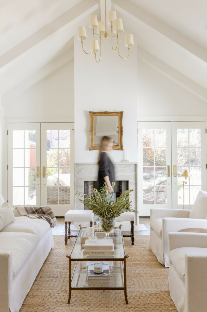
Because we added on the attached garage we lost the a set of windows, therefore a good amount of natural light. But by adding the French doors we kept that natural light and even enhanced it a bit. Plus with the vaulted ceilings everything feels lighter.
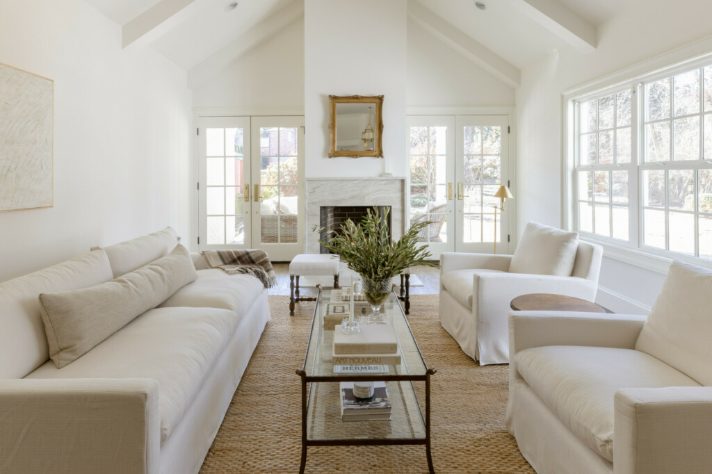
While I love wooden beams, I know they aren’t for everyone. And I felt like this house was a bit more on the traditional side to stylistically fit wood beams. So, as a compromise we ceiling beams in the same paint and finish as the ceiling. So there was still some dimension to accentuate the tall ceilings. I love how they turn out and think they really add a design element to the room, even when it’s empty.
And one of my favorite parts about this area? Is the view from the kitchen. I worked really hard to get the range and sink centered on the fireplace so that when you are washing the dishes, you have a direct line into the living room. And while I would have loved to have done a cast limestone fireplace surround, we went with Taj Mahal Quartzite. Definitely on the expensive end of materials but it was neutral enough to fit the space but nice enough to be a real accent in the living room. I added the 3 inch ledge around the outside to again, add dimension but to also give a little big of a ledge.
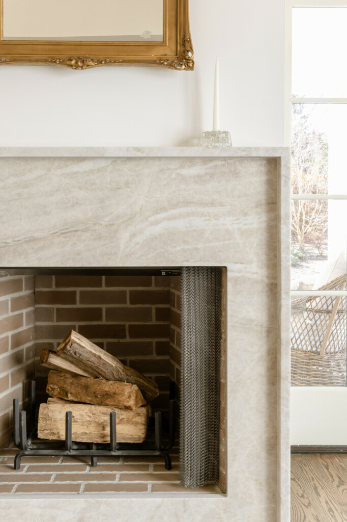
I absolutely love this transformation. It proves that you don’t need to completely change a floor plan to get a big new house. I’m so glad we were able to accomplish what we wanted to out of this space and so thrilled with the result.
Mirror vintage c/o Gaslamp Too
Chandelier c/o Visual Comfort & Co.
Floor Lamp c/o Visual Comfort & Co.
Ottomans c/o Canterbury Antiques



Lovely space! Are the beams painted wood or like a drywall? Also what is the color paint if you don’t mind sharing.